
In this tutorial we will setup a Basic Kibana Dashboard for a Web Server that is running a Blog on Nginx.
What do we want to achieve?
We will setup common visualizations to give us an idea on how our blog/website is doing.
In some situations we need to create visualizations to understand the behavior of our log data in order to answer these type of questions:
+----+-------------------------------------------------------------+
| Nr | Scenario |
+----+-------------------------------------------------------------+
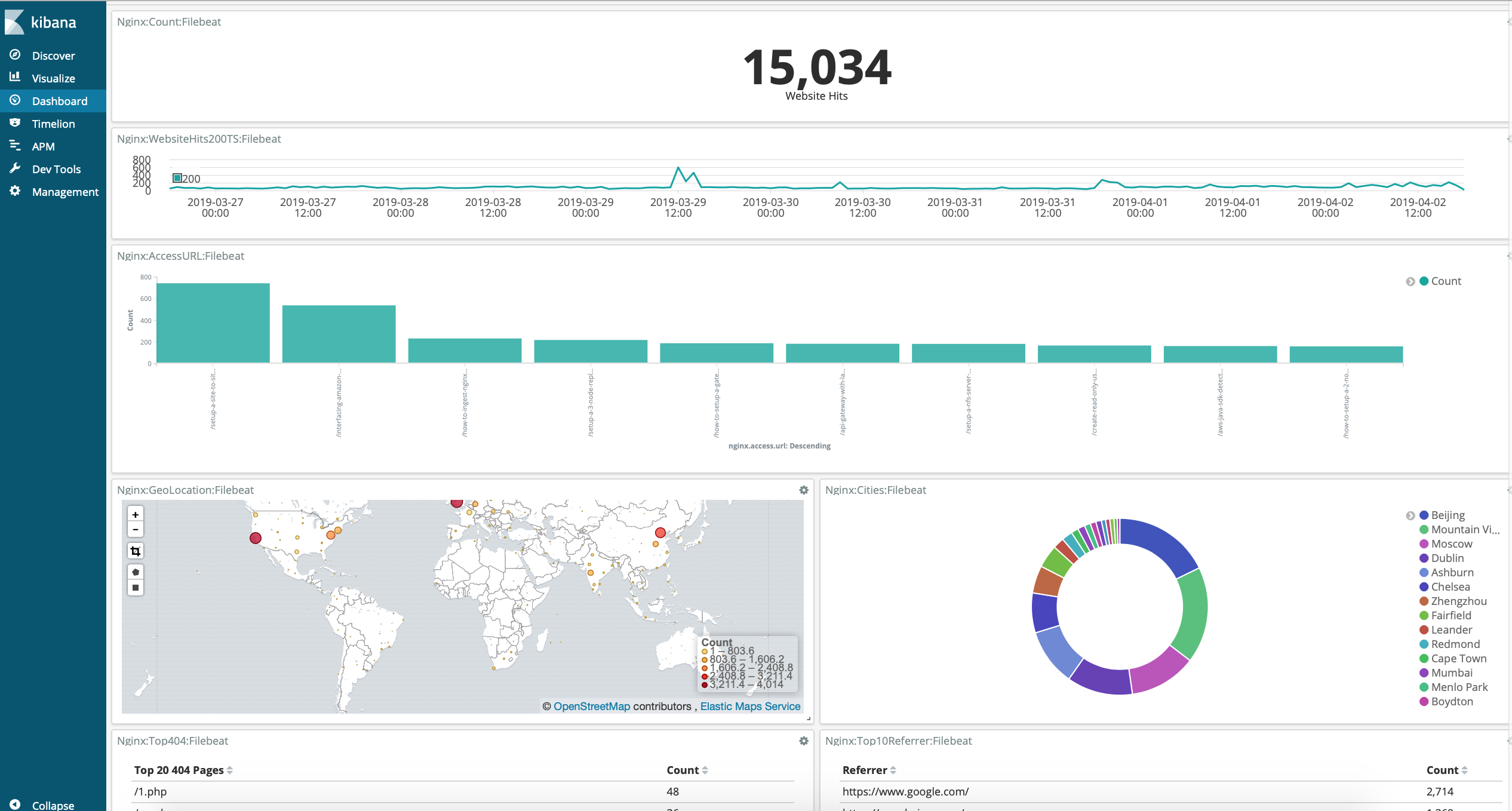
| 1 | Geographical map to see where people are connecting from |
| 2 | Piechart that represents the % of cities accessing my blog |
| 3 | Top 10 Most Accessed Pages |
| 4 | Top 5 HTTP Status Codes |
| 5 | Top 10 Pages that returned 404 Responses |
| 6 | The Top 10 User Agents |
| 7 | Timeseries: Status Codes Over Time |
| 8 | Timeseries: Successfull Website Hits over time |
| 9 | Counter with Website Hits |
| 10 | Average Bytes Returned |
| 11 | Tag Cloud with the City Names that Accessed my Blog |
+----+-------------------------------------------------------------+Pre-Requirements
I am consuming my nginx access logs with filebeat and shipping them to elasticsearch. You can check out this blogpost to set that up.
The GeoIP Processor plugin is installed on elasticsearch to enrich our data with geographical information. You can check out this blogpost to setup GeoIP.
You can setup Kibana and Elasticsearch on Docker or setup a 5 Node Elasticsearch Cluster
Setup Kibana Visulizations
Head over to Kibana, make sure that you have added the filebeat-* index patterns. If not, head over to Management -> Index Patterns -> Create Index -> Enter filebeat-* as you Index Pattern, select Next, select your @timestamp as your timestamp field, select create.
Now from the visualization section we will add 11 Visualizations. Everytime that you create a visualization, make sure that you select filebeat as your pattern (thats if you are using filebeat).
When configuring your visualization it will look like the configuration box from below:
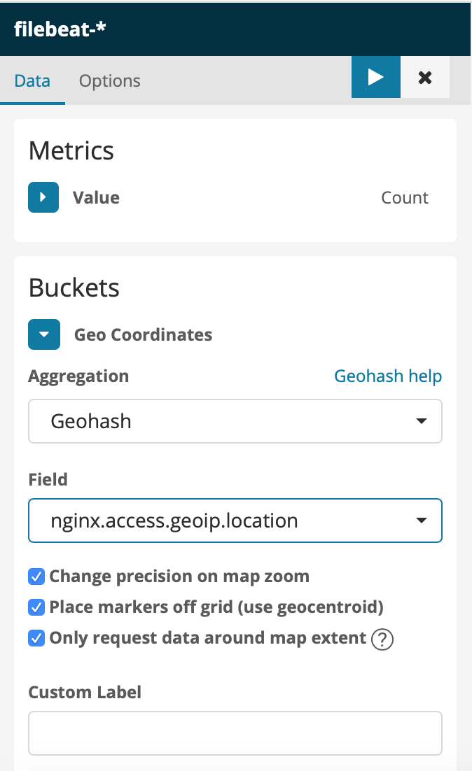
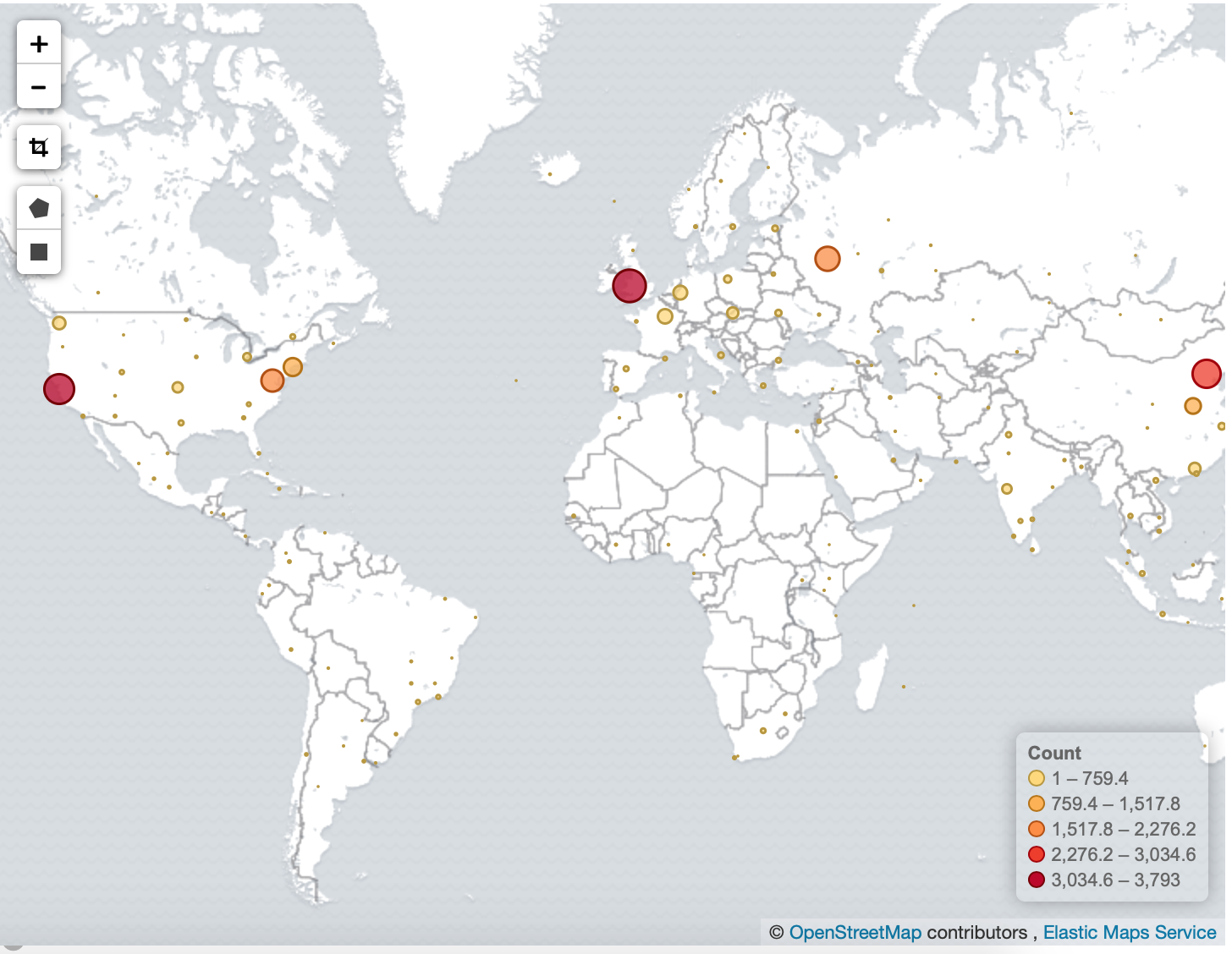
Geomap: Map to see where people are connecting from
Select New Visualization: Coordinate Map
  -> Metrics, Value: Count.
     Buckets, Geo Coordinates, Aggregation: Geohash,
     Field: nginx.access.geoip.location.
Save the visualization, in my case Nginx:GeoMap:Filebeat
Piechart: Cities
This can give us a quick overview on the percentage of people interested in our website grouped per city.
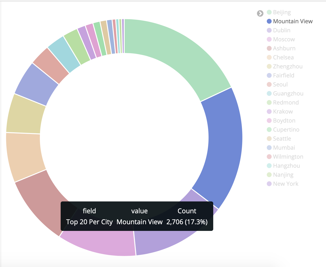
Select New Visualization, Pie
 -> Metrics: Slice Size, Aggregation: Count
 -> Buckets: Split Slices,
    Aggregation: Terms, Field: nginx.access.geoip.city_name,
    Order by: metric: count,
    Order: Descending, Size: 20
Save Visualization.
Top 10 Accessed Pages
Great for seeing which page is popular, and Kibana makes it easy to see which page is doing good over a specific time.
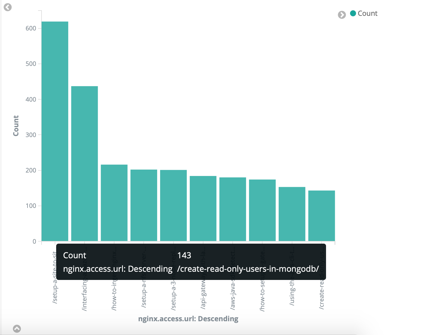
New Visualization: Vertical
  -> Metrics: Y-Axis, Aggregation: Count
  -> Buckets: X-Axis, Aggregation: Terms,
     Field: nginx.access.url,
     Ordery by: Metric count,
     Order: Descending, Size 10
I would like to remove /rss and / from my results, so in the search box:
NOT (nginx.access.url:"/" OR nginx.access.url:"/rss/" OR nginx.access.url:"/subscribe/" OR nginx.access.url:*.txt)
Save Visualization.
Top 5 HTTP Status Codes
A Grouping of Status Codes (You should see more 200's) but its quick to identify when 404's spike etc.
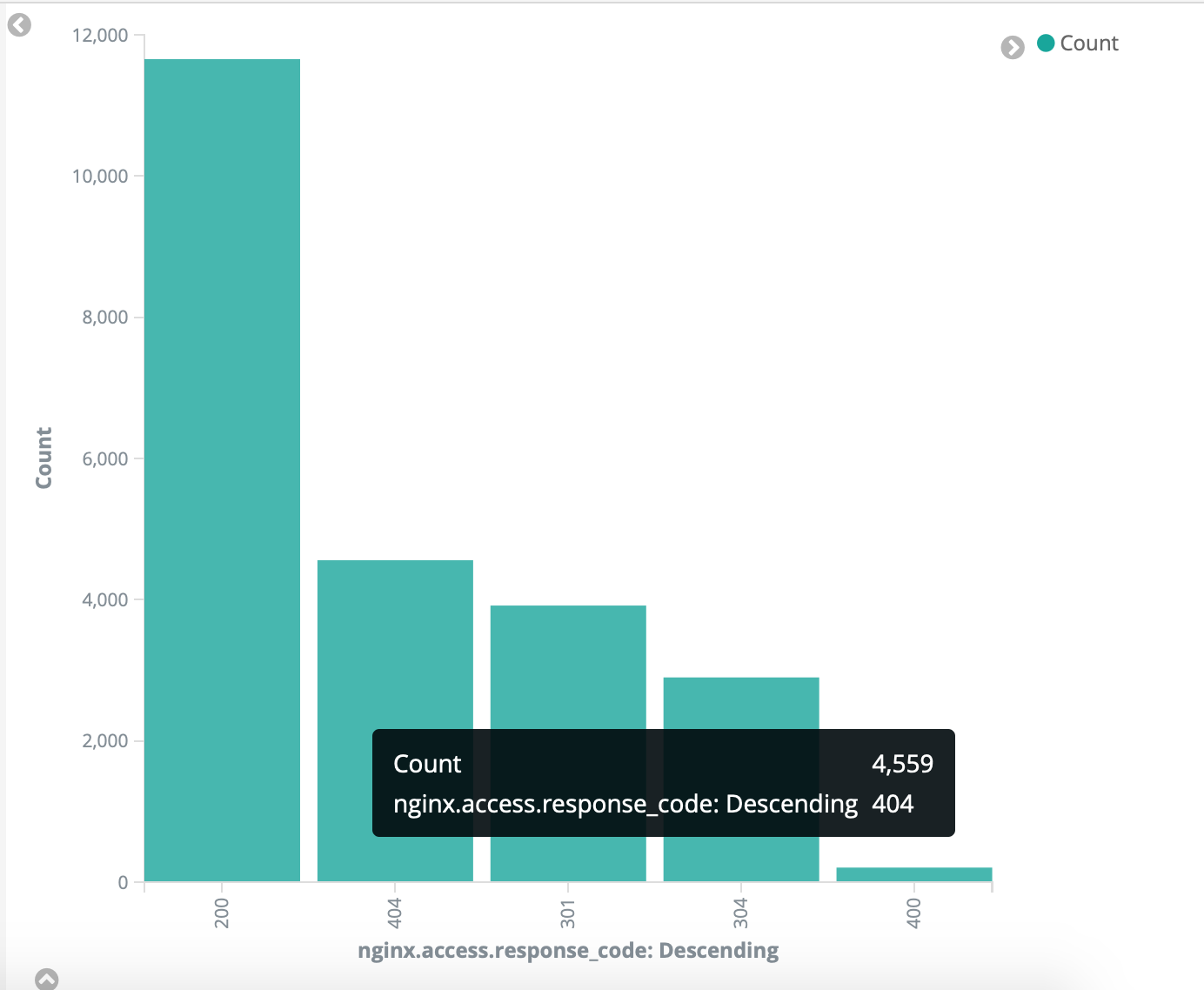
Select new visualization: Vertical Bar
  -> Metrics: Y-Axis, Aggregation: Count
  -> Buckets: X-Axis, Aggregation: Terms,
     Field: nginx.access.response_code,
     Ordery by: Metric count,
     Order: Descending, Size 5
Save Visualization
Top 404 Pages
So when people are requesting pages that does not exist, it could most probably be bots trying to attack your site, or trying to gain access etc. This is a great view to see which ones are they trying and then you can handle it from there.
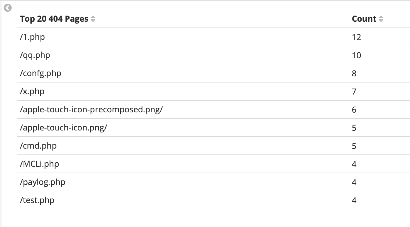
  -> Metrics: Y-Axis, Aggregation: Count
  -> Buckets: X-Axis, Aggregation: Terms,
     Terms, Field: nginx.access.url,
     Order by: Metric count,
     Order: Descending, Size 20
Top 10 User Agents
Some insights to see the top 10 browsers.
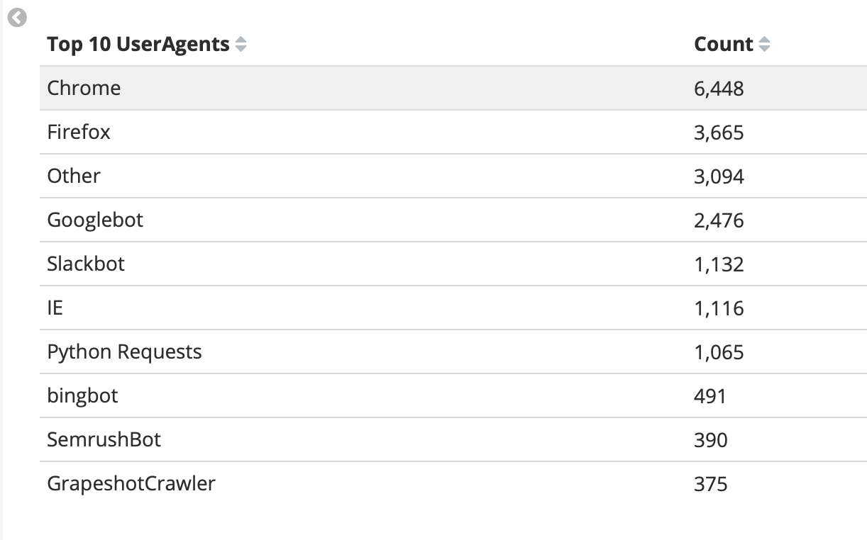
New Visualization: Data Table
  -> Metrics: Y-Axis, Aggregation: Count
  -> Buckets: Split Rows,
     Aggregation: Terms,
     Field: nginx.access.user_agent.name,
     Ordery by: Metric count,
     Order: Descending, Size 10
Save Visualization
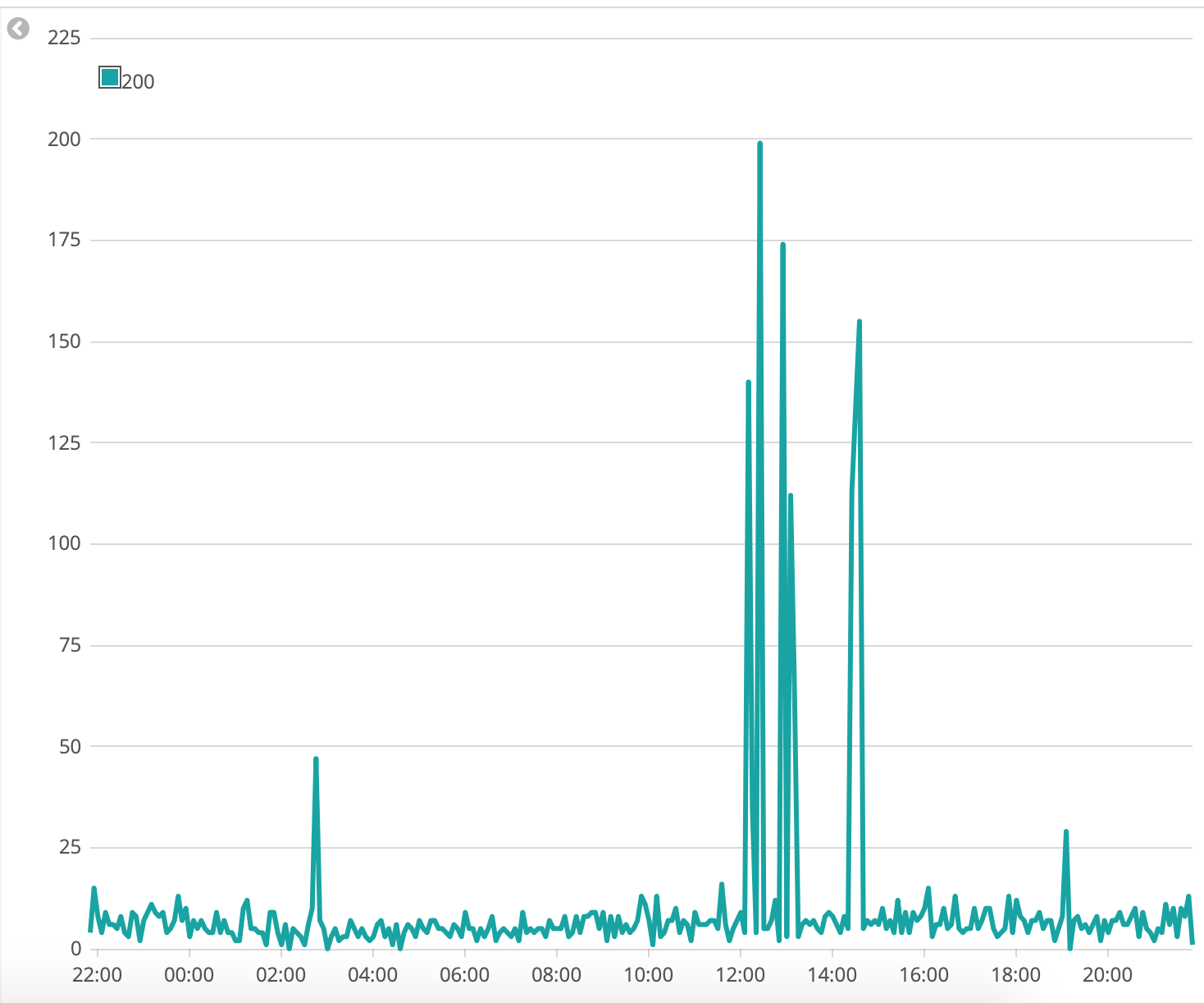
Timeseries: Status Codes over Time
With timeseries data its great to see when there was a spike in status codes, when you identify the time, you can further investigate why that happened.
New Visualization: Timelion
.es(index=filebeat*, timefield='@timestamp', q=nginx.access.response_code:200).label('OK'), .es(index=filebeat*, timefield='@timestamp', q=nginx.access.response_code:404).label('Page Not Found')
Timeseries: Successfull Website Hits over Time
This is a good view to see how your website is serving traffic over time.
New Visualization: Timelion
.es(index=filebeat*, timefield='@timestamp', q=nginx.access.response_code:200).label('200')
Count Metric: Website Hits
A counter to see the number of website hits over time.
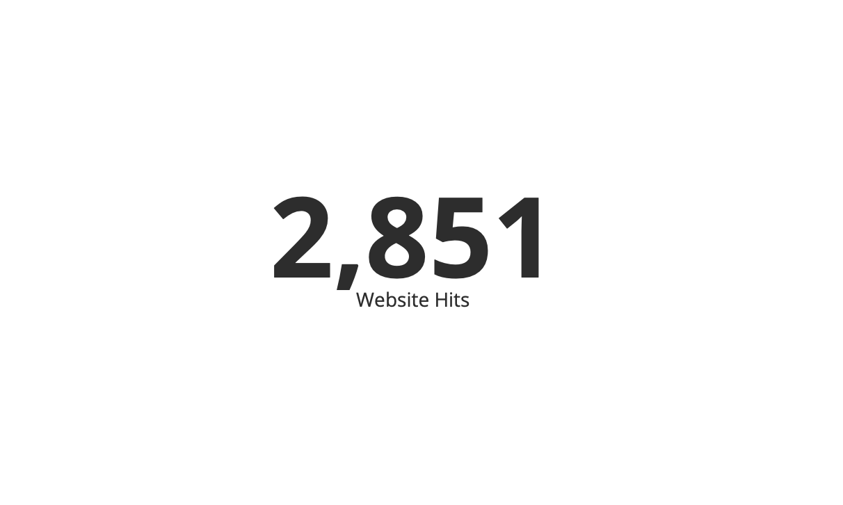
New Visualization: Metric
  -> Search Query: fields.blog_name:sysadmins AND nginx.access.response_code:200
  -> Metrics: Y-Axis, Aggregation: Count
Average Bytes Transferred
Line chart with the amount of bandwidth being transferred.
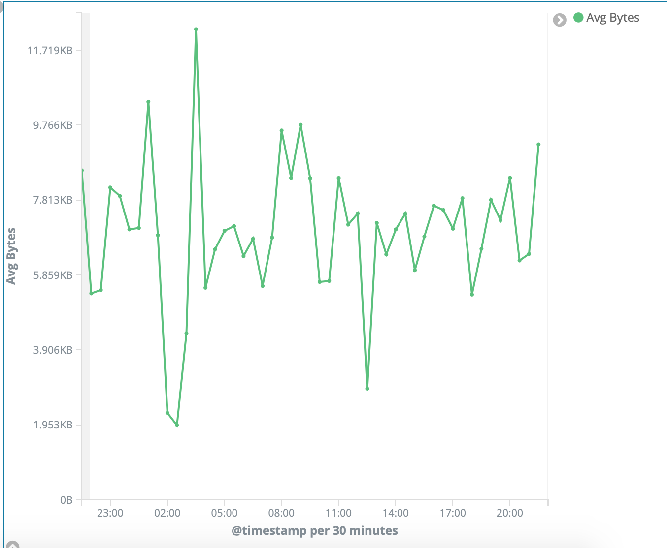
New Visualization: Line

-> Metrics: Y-Axis, Aggregation: Average, Field: nginx.access.body_sent.bytes
-> Buckets: X-Axis, Aggregation: Date Histogram, Field: @timestamp
Tag Cloud with Most Popular Cities
I've used cities here, but its a nice looking visualization to group the most accessed fields. With server logs you can use this for the usernames failed in ssh attempts for example.
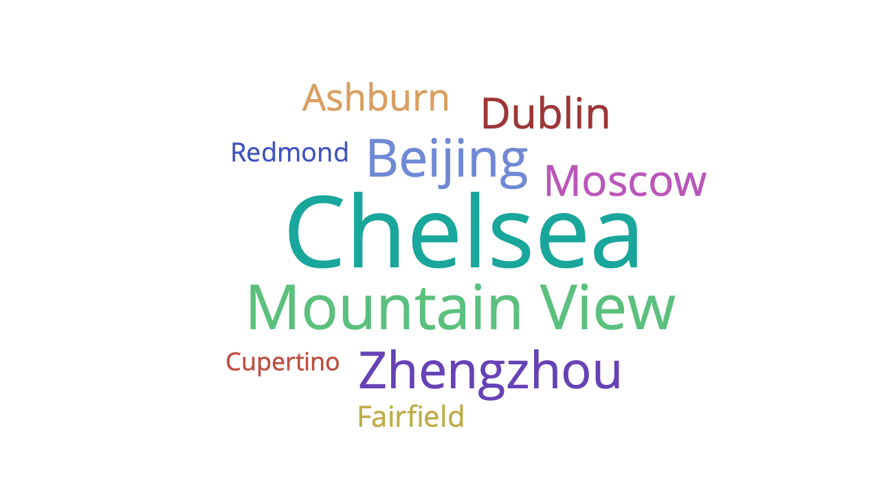
  -> Metrics: Tag size, Aggregation: Count
  -> Buckets: Tags,
     Aggregation: Terms,
     Field: nginx.access.geoip.city_name,
     Ordery by: Metric count,
     Order: Descending, Size 10
Create the Dashboard
Now that we have all our visualizations, lets build the dashboard that hosts all our visualizations.
Select Dashboard -> Create New Dashboard -> Add -> Select your visualizations -> Reorder and Save
The visualizations in my dashboard looks like this:
This is a basic dashboard but its just enough so that you can get your hands dirty and build some awesome visualizations.
Comments